Creating a Legendary Brand Style Guide

The Tale of Brand Style Guides
Once upon a time, there lived a craftsman named Johannes Gutenberg. In a charming little village in Germany, Gutenberg worked day and night on his inventions. His most famous work was the first-ever printing press, which revolutionized the spread of information throughout the world and laid the foundation for content creators for centuries to come.
A brand style guide is a document that outlines how a brand should be presented.
Style guides date as far back as publications themselves. Newly formed newspapers and print publications used style guides to form the consistency of language and layout throughout all their issues. And as media formats developed and evolved, style guides became more important than ever before. Now style guides are used over every platform and media channel, from print to social media.
But our tale doesn’t end here. We are going to take you on an adventure through style guides so you have all the resources you need to create your own brand guide.
Brand guide backstory
While there are many ways to create a brand guide, they all have a similar goal: to ensure a continuous brand experience. This means that with every encounter of the brand or product there are the same underlying traits, like colors, typography, language, etc.
Brand uniformity is important because it encourages customer loyalty. For instance, if you’re an ice cream lover (like us!), then you probably know brands like Ben and Jerry’s, Häagen-Dazs, and Magnum. In fact, you probably have an image in your head of what these ice creams actually look like.
Taking a closer look at Ben and Jerry’s, the company has brand elements that make the product recognizable. A consistent font and color scheme are a given, but Ben and Jerry’s has something even more special. The blue sky with cartoon clouds and green pastures. The black and white cow doing something silly. Oh and don’t forget the “flavor tower” that illustrates the ice cream make-up.
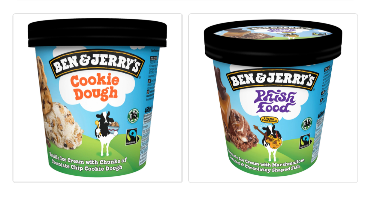
Images sourced from Benjerry.com
The point is, companies like Ben and Jerry’s are experts in branding. Their products are presented in a way where customers can easily recognize their ice cream. And since we’re all creatures of habit and tend to buy from brands we are familiar with, a consistent style and brand results in higher levels of customer loyalty.
So how do you recreate this for your own services or product? Brand style guides of course! Brand guides give you the opportunity to lay out all of your branding details; like variations of your logo, different color palettes, typography information, everything.
On the quest for a successful brand guide
When it comes to any kind of content collaboration, whether it comes to blog articles or social media campaigns, it's necessary to have guidelines in place to ensure that any content that is created is uniform and represents the brand accurately. Ideally, a brand guide should represent the brand's persona. When creating a brand style guide, take these points into consideration.
1. Company Background
In this section, you should aim to get a snapshot of your client’s company and business story. This includes a short introduction, a short background story, as well as the mission and value statements.
- Introduction: XZY is a leading contract manufacturer for nutraceutical markets. We produce a wide range of products, from gummy bears to sport jellys, for many major companies in North America and Europe. We focus on making quality products from organic and fair trade ingredients.
- Background: XYZ was created from Jane Doe’s vision that science and creativity could coincide together. After graduating from college in food technologies, Doe wanted to recreate how the world perceives vitamins. She would find a way to put supplements and nutrients into something that everyone enjoys, candy. Ten years of building her business later, Doe launched XYZ and revolutionized the way we do vitamins. Inspiring a coexistence of creativity and practicality was Doe’s vision, and now we make it our mission.
- Mission: To bring together health and creativity
- Values: Honest, transparent, creative
The combination of these elements hints at the company's tone of voice which will guide blog content, visual media, slogans, etc--all very important characteristics to establish brand consistency.
2. Audience
Your target audience, or those who will be purchasing your service or product, is a crucial section in your brand style guide. One of the best ways to ask for this information is through a buyer persona.
A buyer persona is a fictional, but research-based, representation of ideal customers. Buyer personas narrate who the customers are, the challenges they face, and how they make certain decisions. You can build this character off of your target audience description from your creative brief.
Sometimes you might have multiple buyer personas. Each character plays a different role in the process, but they both have different criteria for assessing the product. Therefore, you would need two (or more) personas to represent your audience.
By including a buyer persona in your brand guide, you can better understand the target customers. In turn, you can tailor the content and imagery of your design project to the correct audience.
3. Imagery
Whether it’s a logo, product images, or marketing advertisements, your creative project will likely incorporate imagery. Having consistent brand imagery is not only helpful in creating a visual brand identity, but also creates a positive first impression.
Let’s start with the logo guidelines. You may understand the colors and shapes of the logo, but what will it look like in different environments? On a black background, an app face, on the website? This section is where all of this information will come together so that your logo will never be stretched, altered, or inconsistent.
Some questions to consider:
- What are the proper proportions of the logo?
- How much space does the logo require?
- What color variations will you use?
When it comes to imagery in general, you’ll know if an image communicates the “feel” of the brand. You can visually demonstrate this feeling with a mood board so that everyone is on the same page on how to interact with the brand.
4. Color Palette
Color is a visual expression of a brand and tells a story about a company. That’s why it’s imperative to include a color palette in your style guide outline. Colors evoke certain emotions and create an association between a product or service and a company. For instance, some psychology studies say that bright red and yellow colors increase heart rates and blood pressure, encouraging customers to act quickly both physically and emotionally. That’s probably why fast-food chains utilize such colors!
For your brand guide, a color palette is a full range of colors that a brand uses to convey its identity. There are many ways to approach a color palette, but normally a brand has one or two primary colors and a secondary color. They can be used in logo creations, website design, and print. So make sure your client chooses brand colors carefully!
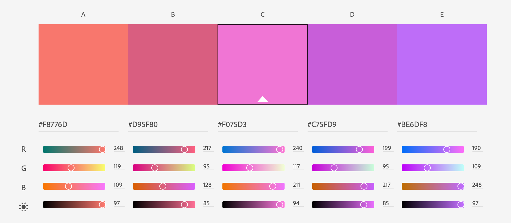
Color palette created on Adobe Color
Staying consistent with colors helps provide a common link between the product and the brand, creating that feeling of trust and familiarity.
💡 Helpful hint: Make sure to include color codes when filling out the style guide. That way, you're never left to guess what hue, shade, or brightness your brand prefers to use.
5. Typography
The typography section of your brand guide should show the fonts that you can use when designing the brand. It should specify sizing, spacing, capitalization, and proper usage of type. This contributes to the overall consistency of the brand, whether it’s on the website, in print, newsletters, etc.
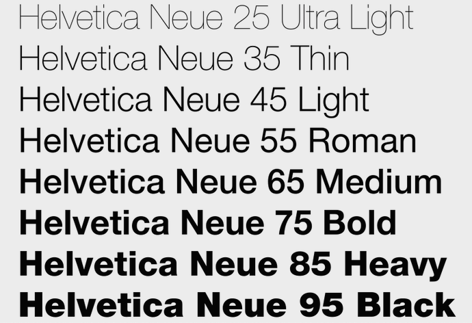
Similar to color palettes, typography can communicate a certain feeling to the customer. For example, rounded and script fonts feel more lighthearted and playful, while square and stiff fonts feel more serious and professional. It all depends on what your brand is trying to convey.
6. Language
How a company represents itself verbally can be just as effective as the visual elements of a brand. That’s why a language section within your brand style guide is a must-have.
A language guide doesn't just list out grammar rules and punctuation tricks. Rather, it’s a part of the style guide document that helps content creators, translators, and marketing departments choose a language style that fits the brand. This incorporates details like the tone of voice, types of words to use, language style, purpose, brand voice, etc.
A law firm or government agency, for example, might utilize more formal language, while a tech startup might use more casual language. It all depends! No matter what the company language might be, consistency is key. You want to make sure the brand markets a message on every platform in the same way.
Here are some ideas to add to the language section of your brand guide:
- Will the language be formal or informal? Some languages have multiple options on how to address a reader, depending on the formality of a situation. In German and French, you can use formal cases like Sie/Vous.
- Choose the writing style. This plays into what we mentioned before; is the brand aiming to be playful and humorous or serious and professional? How should it be perceived?
- Decide on length preferences. Should the information on the website be long and detailed? Or short and sweet?
- List out grammatical elements. Should headers and sub-headers be capitalized? What about the beloved Oxford comma?
Legendary brand style guide examples
We mentioned earlier that Ben and Jerry’s do a great job of branding their ice cream, but here are two more examples of companies that have their style guides on lock.
1. Spotify
When it comes to Spotify’s style guide, the best word to describe it is ‘all-encompassing.” They list out everything from color matching mistakes and false usage of iconography, to logo manipulation and sizing problems. Even their style guide within itself follows their style guideline!
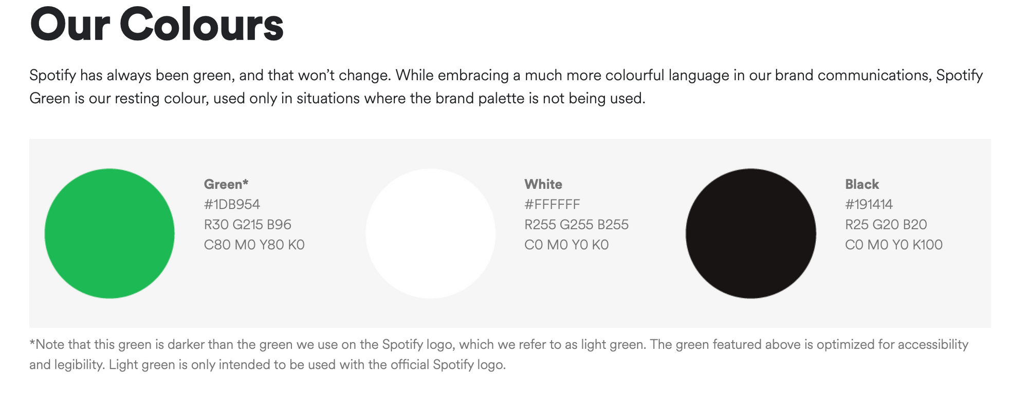
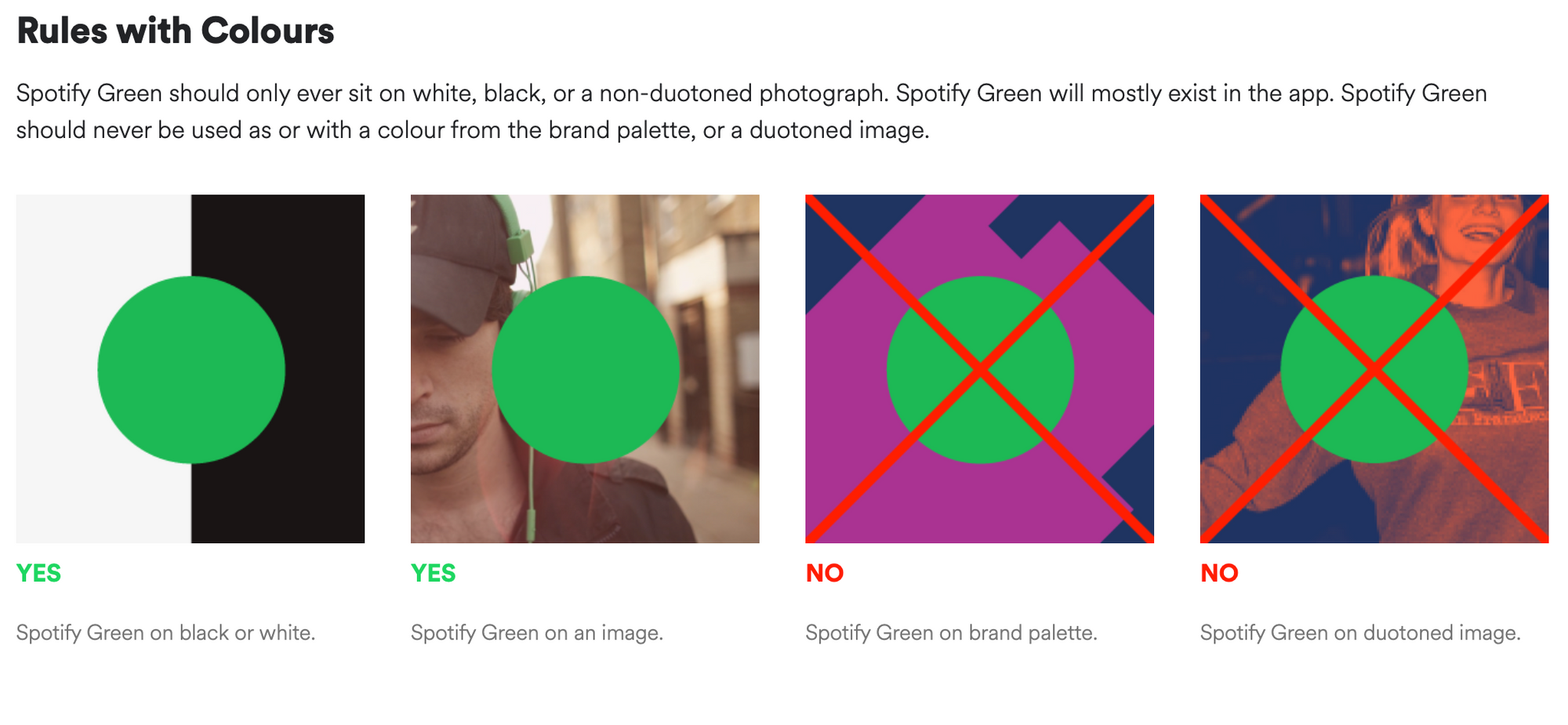
Pictures sourced from Spotify’s style guide
Because of Spotify’s success in brand consistency, this style guide is a perfect example to use as inspiration.
2. Uber
Uber’s style guide might seem just black and white, but looking deeper, it incorporates so much more. Composed of nine primary elements, Uber focuses heavily on creating a simple yet effective branding.
In the color section, their style guide lists out the primary colors (black and white), but go into detail about secondary and safety colors. Inspired from the colors of traffic, Uber incorporates red, yellow, and green into their advertising, apps, and website. The safety color, unique to the brand, is used only moments of support.
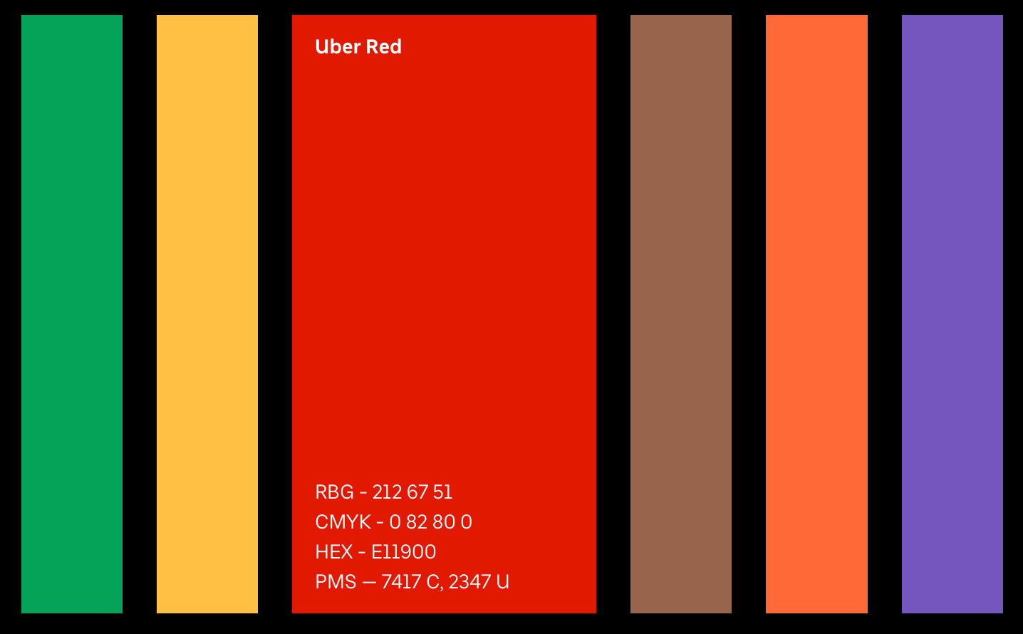

Pictures sourced from Uber’s style guide
Another interesting component in Uber’s style guide is the language guidelines. It states that the company will not use Uber as a verb or a noun. You can’t say for instance “let’s Uber to the party” or “my Uber has an Aux cord.” While this might not be the case for it’s users, Uber guidelines specify this clearly.
And they lived happily ever after
When venturing out into the realm of style guides, always remember to incorporate the key elements that we discussed in this blog; company background, audience, imagery, color pallets, typography, and language. That way, you can create a unified brand identity that keeps customers coming back.
If you are too caught up in other adventures and tales, your fairy godmother is here to help! Check out Collato’s style guide template to help you through the whole process:
FAQ
🍦 Related topics you may be interested in:
1. The Ultimate Guide to Brand Management
2. The Beginner's Guide to Marketing Campaigns
